3 dental clinics, 1 overall identity to embrace all of Tandbros clinics, all on one website.
A focus of the design was to decrease fear of going to the dentist and raise the credibility of Tandbros clinics. It has been done with soft shapes, warm colors, handwritten font and a lot of nice, smiling people.
We’ve had the job of developing the website in WordPress. Here we always focus on creating a user friendly backend, so the editor has an easy way to create new content and change over it time.
The logo
We have, together with Tandbro, created an identity, that embraces the clinics that before was three separate and independent clinics. The symbol in the logo is created by inspiration of the visual shape of a dental bridge, but at the same time it has hidden symbols, that fit in with the wish of making a visit to Tandbros clinics more human and less frightening.
Hidden symbols in the logo
The logo on colored backgrounds
The symbol as graphic elements
Looks like something you’d like?
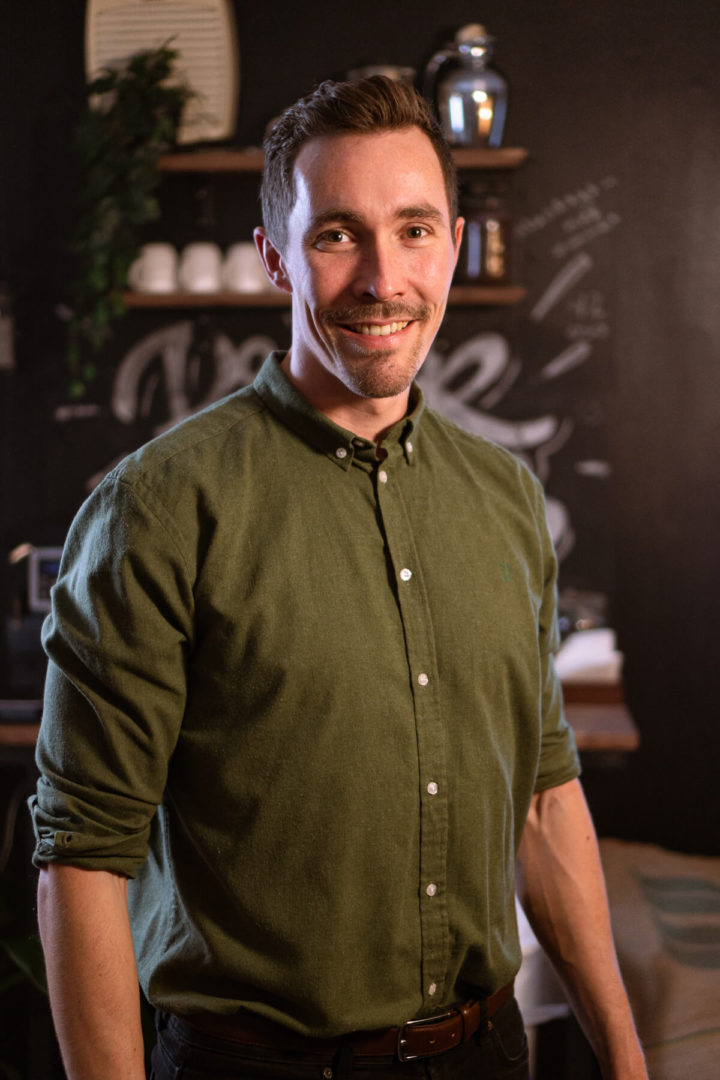
Get ahold of René here and have a chat about, how we can help you.
He’s available on 61 10 29 10 or ra@29x.studio

René Albertsen
Digital Creative